
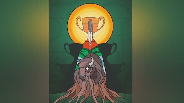

A Saskatchewan artist is commemorating the Saskatchewan Roughriders’ recent Grey Cup victory through a fresh tribute emblem. The Riders clinched the championship by defeating the Montreal Alouettes 25-17 in a thrilling final on Sunday, marking Saskatchewan’s first Grey Cup triumph since 2013.
Chris Chipak, an artist and illustrator hailing from Red Pheasant Cree Nation near North Battleford, crafted a design to honor the victory. Drawing inspiration from a previous Indigenous logo he had designed for the Riders, which has gained significant popularity among fans, Chipak incorporated elements from it into the new artwork. The emblem prominently showcases the Grey Cup along with the silhouettes of the team’s four other trophies in the background.
In the design, a single feather emerges from the center of the trophy, illuminated by the radiant sun in the backdrop. Below, a buffalo is depicted at the base, its mane transforming into roots that extend across the ground. Chipak revealed that the idea for the illustration struck him while watching the championship game and noticing fans adorned in his earlier logo design.
Last season, Chipak introduced the Indigenous Riders logo, featuring symbols like the buffalo, river, sun, and the iconic “S” nestled between two feathers as part of the team’s Truth and Reconciliation initiative. The full-color version of this logo, unveiled earlier this year, has garnered a strong following among supporters.
Expressing his gratitude for the enthusiastic reception of his work by Indigenous families, Chipak emphasized the deep connection they have formed with the logo. He views it as a symbol that resonates with multiple generations within these families, instilling a sense of pride and unity.
The artist explained that the new design aims to pay homage to the passion and significance of the championship win, as well as the strong bond the team has established with fans across the province. Additionally, preceding the Grey Cup game, Chipak also crafted a digital illustration of Riders running back A.J. Ouellette, further fueling the anticipation leading up to the final showdown.
Chipak envisions the new emblem serving as a lasting memento of the historic victory, symbolizing how sports can unify people throughout Saskatchewan in celebration of their team’s success.